Expected behavior
You have two workspaces each containing simple x,y data. If you right-click->plot one dataset, you can drag the other onto the newly plotted graph. The order in which you do this should only change the colours of the lines not their intensities.
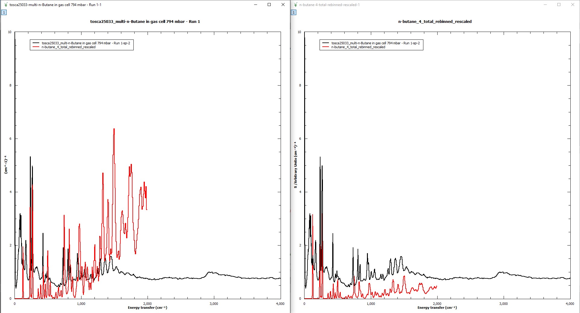
Actual behavior
Plotting data “A” then dragging data “B” onto it affords a different plot for data “B” than if you plot a graph of data “B” then drag data “A” on top of it. See attached image for an example.
Steps to reproduce the behavior
So far I have only seen this specifically using experimental TOSCA data as one dataset and an AbINS output spectrum for the other dataset. When I plot the experimental data and then drag the AbINS spectrum on top, the anomalous behaviour occurs. When I plot the AbINS data first, it looks correct, and then plotting the experimental spectrum over that causes the correct behaviour.
I am happy to provide specific data if necessary. I’m unsure if this kind of behaviour can happen with other types of data.
Platforms affected
I have tested this on MantidPlot 4.1 revision g4f102e5150a.
A test on Workbench from the same release did not show the anomalous behaviour - it seems specific to MantidPlot.
I am using Windows 10.
EDIT: 2020-02-18
I just updated to the current Mantid Nightly release (2020-02-11) and was using Workbench to achieve the above and encountered the same problem again.
Importantly to reproduce it there is an extra step that I missed, above.
I take a workspace that is an AbINS spectrum from a Gaussian output file - call this workspace “abins”. Plotting this over experimental data leads to the correct and expected result. However, if I create a new workspace “abins_rebinned” by rebinning “abins” with the default TOSCA data reduction bin string (i.e. “-2.5,0.015,3,-0.005,4000”) then I get the anomalously high intensity at higher frequencies as described in the image when I plot this on top of experimental data. Lastly, if I plot the workspace “abins_rebinned” FIRST and then apply the experimental data on top, the spectrum appears correct.